Python数据分析
Anaconda发行版
Jupyter notebook
安装和文档
启动
运行机制
主界面
新建文档
工作界面
文档结构
编辑和命令模式
快捷键
执行和输出
Markdown单元
图片和视频
幻灯片
导出格式
魔法命令
Numpy
基础知识
数据类型
创建数组
数组运算
通用函数
索引切片迭代
添加删除去重
形状变换
堆积数组
分割数组
视图和复制
广播机制
花式索引
布尔索引
统计方法
随机数
Pandas
Series
DataFrame
Index
重建索引
轴向上删除条目
索引和切片
算术和广播
函数和映射
排序和排名
统计和汇总
文件读取
分块读取
写出数据
JSON和Pickle
HDF5
EXCEL文件
Web交互
数据库交互
删除缺失值
补全缺失值
删除重复值
替换
重命名轴索引
离散化和分箱
检测和过滤
随机和抽样
字符串操作
分层索引
分层索引进阶
合并连接
粘合与堆叠
重塑
Matplotlib
配置环境
使用常识
保存图形
两种图画接口
使用中文
线型图
颜色线型和标记
坐标轴上下限
坐标轴刻度
图题、轴标签和图例
配置图题
配置图例
颜色条
文本、箭头和注释
散点图
直方图
条形图
饼图
误差线
等高线
多子图
patch
自定义坐标轴刻度
风格样式展示
下一步
直方图
阅读: 5082 评论:1使用hist方法来绘制直方图:
np.random.seed(2019)

# 创建数据
mu = 100  # 分布的均值
sigma = 15  # 分布标准差
x = mu + sigma * np.random.randn(400) # 生成400个数据

num_bins = 50  # 分50组

plt.hist(x, num_bins, density=1, )

plt.xlabel('Smarts')
plt.ylabel('Probability density')
plt.title(r'Histogram of IQ: $\mu=100$, $\sigma=15$')

绘制直方图,最主要的是一个数据集data和需要划分的区间数量bins,另外你也可以设置一些颜色、类型参数:
plt.hist(np.random.randn(1000), bins=30,normed=True, alpha=0.5, histtype='stepfilled', color='steelblue', edgecolor='none')
histtype直方图的类型,可以是'bar'、 'barstacked'、'step'和'stepfilled'。
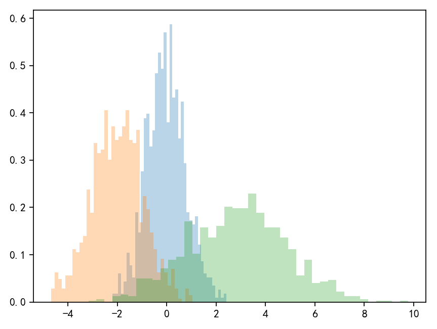
有时候我们也会做一些直方对比图:
x1 = np.random.normal(0,0.8,1000)
x2 = np.random.normal(-2,1,1000)
x3 = np.random.normal(3,2,1000)

params = dict(histtype='stepfilled', alpha=0.3, normed=True,bins=40)

plt.hist(x1, **params)  # 以字典的形式提供参数
plt.hist(x2, **params)  # 在同一个子图中绘制,颜色会自动变化
plt.hist(x3, **params)
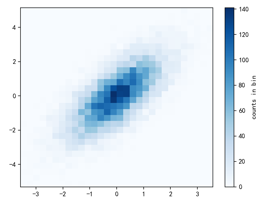
除了一维的直方图,还可以使用hist2d方法绘制二维的直方图:
mean = [0,0]  # 忽略数据的创建过程
cov = [[1,1],[1,2]]
x,y = np.random.multivariate_normal(mean, cov,10000).T

plt.hist2d(x,y,bins=30,cmap='Blues')  #以蓝色为基调
cb = plt.colorbar()  # 插入颜色条
cb.set_label('counts in bin')  # 设置颜色条的标签
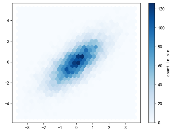
hist2d是使用坐标轴正交的方块分割区域,还有一种常用的方式是正六边形也就是蜂窝形状的分割。Matplotlib提供的plt.hexbin就是满足这个需求的:
plt.hexbin(x,y,gridsize=30, cmap='Blues')
plt.colorbar(label='count in bin')
更多hist相关内容参考:https://matplotlib.org/api/_as_gen/matplotlib.axes.Axes.hist.html
plt.hist2d函数的前两个参数可以是一维数组,不能是多维;plt.hexbin函数前两个参数可以是一维数组也可以是多维。